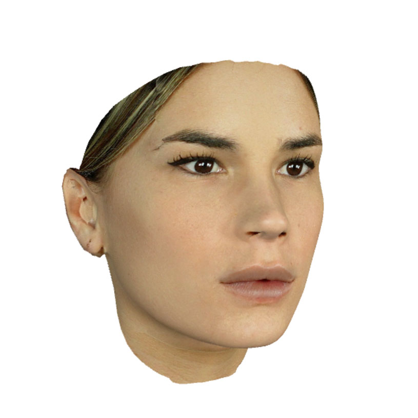
My
My is an application where patients can create their 3D and find and book consultations with Doctors. Videoconsultations can also be carried out with the doctors directly using the app. Doctors can personalise the primary color used throughout the app in line with their branding.
Copy
Well written copy is essential for a good user experience. Take example from the Do's & Don'ts below when writing your copy.
Be clear and concise
Try to remove any unnecessary words or phrase. Avoid computer speak and system generated errors, and aim copy at humans ensuring copy is meaningful and guides the user towards their next step.
| Would you like to save your changes? | Save changes? |
| Upload three photos | Upload 3 photos |
| An authentication error has occured | Please enter your password |
Use the present tense
Write in present tense to make the copy simpler and more digestible. Avoid future tense.
| Video has been downloaded | Video downloaded |
| This will send you a notification | This sends you a notification |
Platform friendly
Use language that’s consistent with the user’s platform. Terms used when describing the interaction with a desktop app may not work on mobile platforms. Eg. for mobile device interactions:
| Click | Tap/press |
First person copy
Using first-person copy (“me”) rather than second person (“you”) to help establish a more personal bond.
| View your 3D | View my 3D |
Easily translatable
Use simple and direct language to make content easy to understand, and easy to translate. 4 things to consider when writing for localisation:
- Word length
- Word order
- Grammatical gender
- Cultural differences
$container-max-width-xs |
Max 350px |
$container-max-width-sm |
Max 500px |
$container-max-width-md |
Max 680px |
$container-max-width-lg |
Max 800px |
$container-max-width-xl |
Max 1240px |
$container-max-width-xxl |
Max 1400px |
$container-max-width-xxxl |
Max 1600px |
Breakpoints
Breakpoints are the points at which the content adapts to provide the user best possible user experience and assure that the design and layout does not break.
$breakpoint-sm |
615px |
$breakpoint-md |
1023px |
$breakpoint-lg |
1400px |
$breakpoint-xl |
1600px |
Modifiers
Use the following modifier classes on elements in order to alter their style.
| Text | .txt-center |
Center aligns text |
|---|---|---|
.txt-left |
Left aligns text | |
.txt-right |
Right aligns text | |
.txt-justify |
Justifies text | |
.uppercase |
Transforms all characters to uppercase | |
.lowercase |
Transforms all characters to lowercase | |
.underline |
Underlines text | |
| Spacing | m[t,b,l,r]-[0–5] |
Adds margin, size 0 to 5, on a specific side (eg: mt-3) |
p[t,b,l,r]-[0–5] |
Adds padding, size 0 to 5, on a specific side (eg: pt-3) | |
| Visibility | .is-hidden |
Hides element |
.vis-hidden |
Adds visibility hidden | |
.hide-sm |
Hide up to $breakpoint-md |
|
.hide-md-up |
Hide from $breakpoint-md |
|
.hide-md-up |
Hide from $breakpoint-md |
|
.show-lg-up |
Show from $breakpoint-lg |
|
.hide-lg-up |
Hide from $breakpoint-lg |
Input
Input fields enable users to provide information.
Standard
Dropdown
A dropdown presents a list of options.
Checkbox
Checkboxes are used when there is a list of options and the user may select multiple options, including all or none.
Radio
Radio buttons are used when a list of two or more options are mutually exclusive, meaning the user must select only one option.
Standard
iOS style
No more than 3 options should be displayed when using this format.
Loader
Loaders are used when information takes an extended amount of time to process and appear on-screen, notifying users that loading is underway.
Step indicator
Step indicators are used when to indicate how many steps there in a process e.g Book a consultation, and to show which steps have already been completed.
Tabs
Tabs are used to quickly navigate between views within the same context.
