Crisalix Brand Guidelines
In this section you will find an overview of logo use, color palette, typography and design elements for the Crisalix brand. Please follow these style guidelines when producing content for Crisalix. As brand ambassadors, it’s our responsibility to ensure we are aligned in the way we communicate Crisalix and our products.
Logos
Crisalix logos are available as a full color logo (CMYK and RGB) for use on lighter backgrounds. For use on darker backgrounds, a version with white logotype is available, however ensure the background is dark enough to create contrast and ensure visbility.
The relative proportions of each logo must not be changed in any way. Ensure that there is sufficient clear space between the Crisalix logo and other graphical or textual elements for them to be interpreted as unique elements (See example with clear space indications). An exception to this rule is when "Powered by" is added above or by the side of the logo. The logo should be present on all pages of marketing material.
Clear space
Minimum size
Typography
Crisalix uses Inter for all communications.
This fonts can be used for all design projects and communications such as brochures, flyers, invitation cards, product branding, website design and social media content, choosing the most suitable depending on the target audience.
To optimise readibility the following should be applied:
- The leading (line-height) as a rule of thumb should be set at approximately 150% of the font size to create a spaced modern feel. As the font size increases the leading should increase and vice versa.
- The maximum width of body text should be between 65 and 75 characters.
- When displaying headlines in UPPERCASE, the tracking (letter space) should be increased slightly.
- Use font weights to emphasize or differentiate content hierarchy.
- Use 700 - bold for bold words within body text.
- Add contrast between headline and body texts by making the body text slightly lighter than the headline text.
Inter Weights:
400 - Regular
500 - Medium
600 - Semi bold
700 - Bold
800 - Extra Bold
Colors
The brands' colors are derived from the Crisalix logo for brand recognition. The use of of multiple colors should be limited. Choose from the following color schemes depending on the design you are creating. Use transparency to add depth and create focus.
Black text is recommended for use on light backgrounds, and white text on dark backgrounds. Instead of using grey, apply high-emphasis or medium-emphasis to create better contrast. Colored text should be used sparingly to draw attention to specific words and apply selective emphasis.
Design on light backgrounds
Backgrounds
Colors
Design on dark backgrounds
Backgrounds
Colors
Design examples

Trademarks
When developing applications in collaboration with third parties that integrate Crisalix products, these products must include the trademark "Powered by Crisalix".
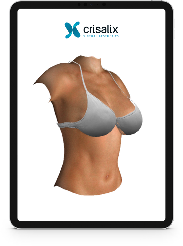
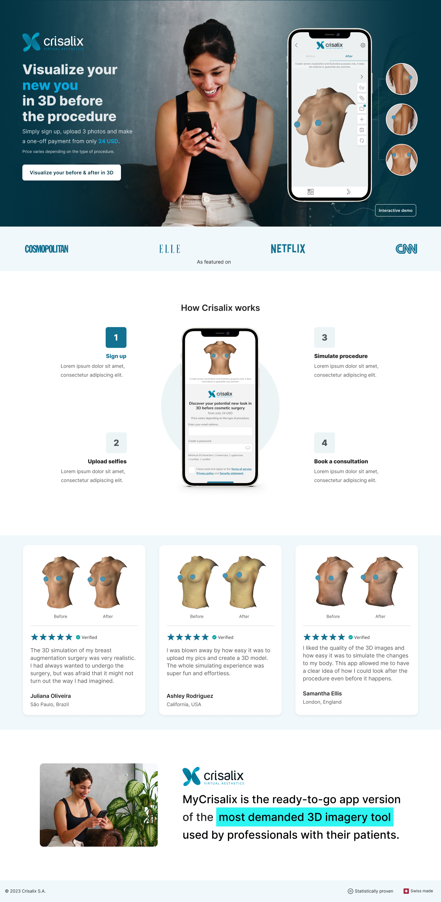
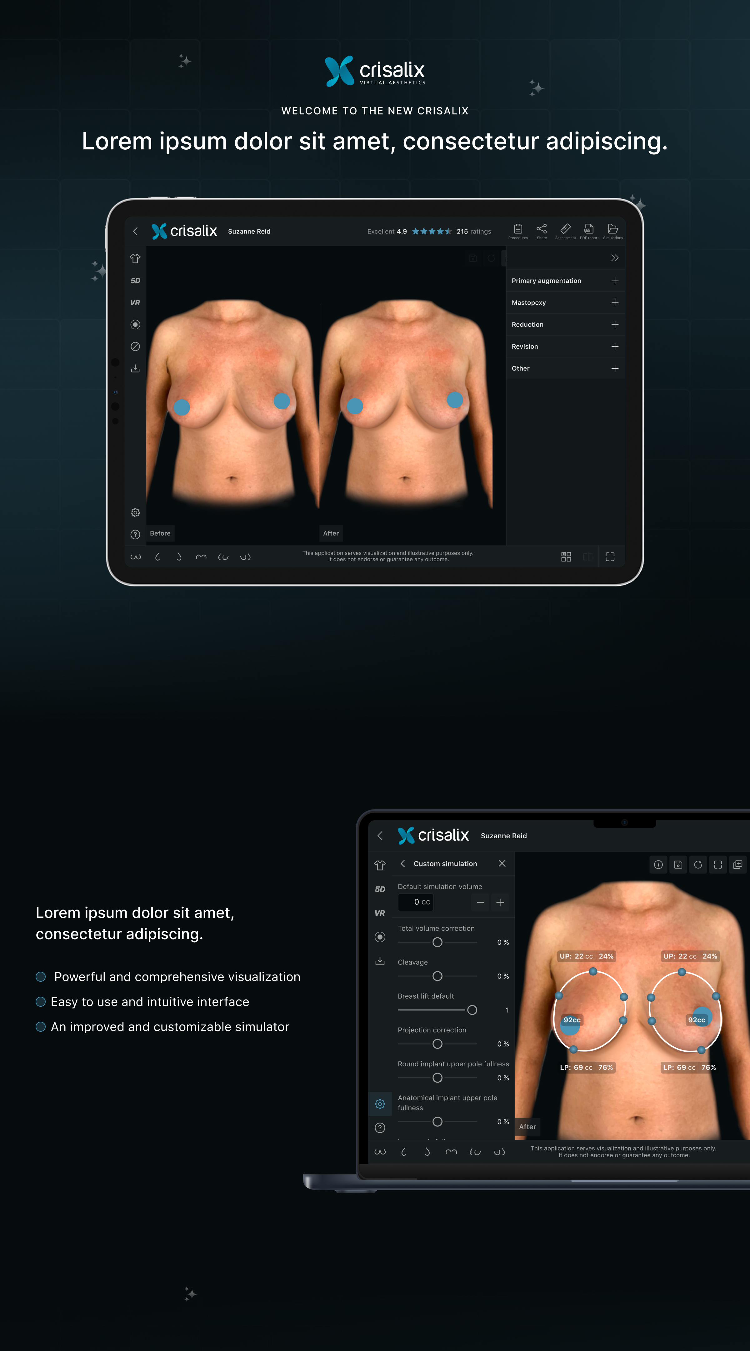
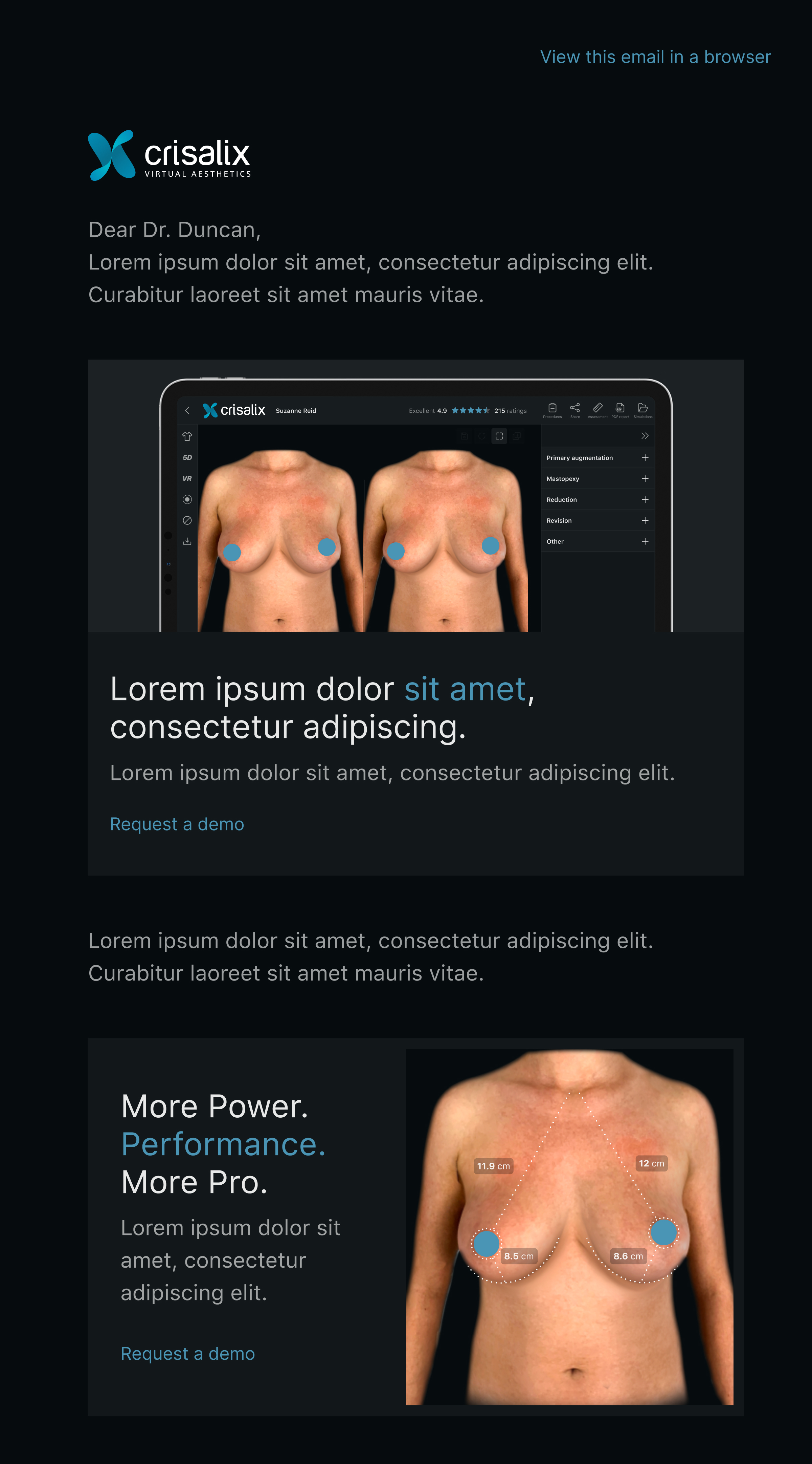
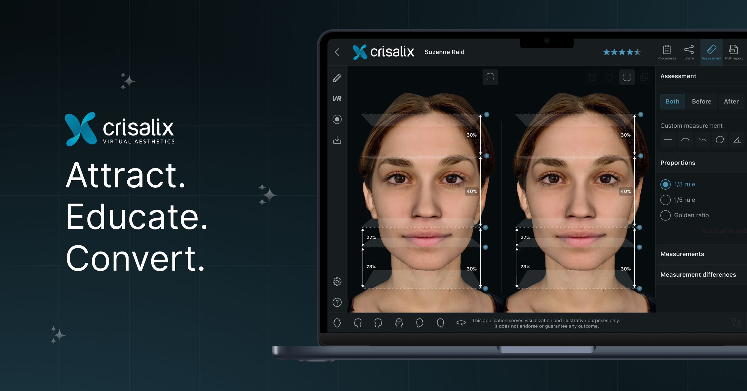
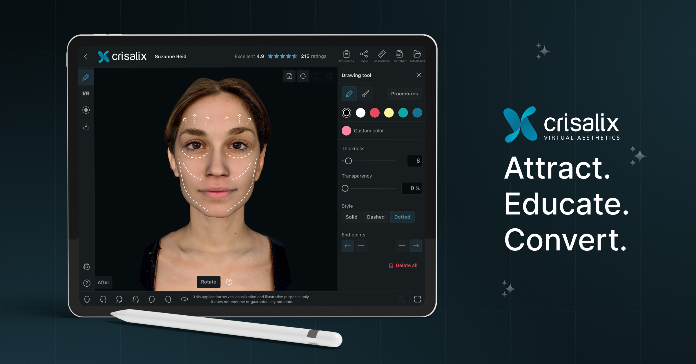
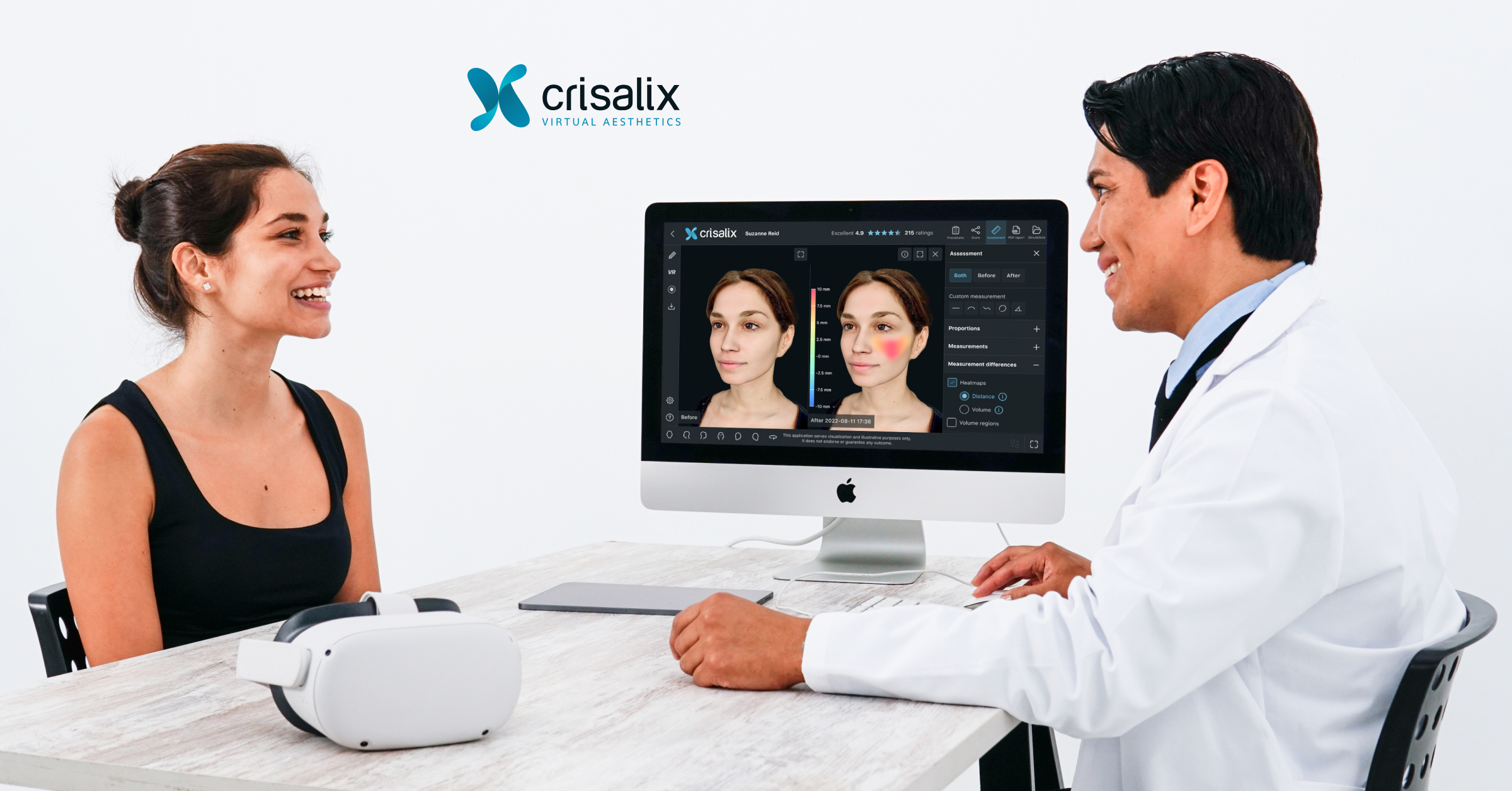
3D Imagery
To showcase Crisalix products, mockups or screenshots should be shown in the latest Apple devices.
When showing 3D images, all or parts of the UI can be removed to avoid cluttered looking imagery. 3D images should be of good quality and with good lighting. 3Ds created from photos taken under fluorescent lighting must be color corrected adjusting white and color balance. Any artefacts should be removed.
Examples: